
Reviving the abandoned
AXS m-Station.
CLIENT — AXS
ROLE — UX & Research, UI Design
CATEGORY — Mobile Application UX, Strategy
In our common quest for survival and stability in Singapore, we hustle between family and work. Managing our finances and remembering the due dates of our bills can be a chore. AXS is an avenue for consumers to pay their respective service providers in one stop.
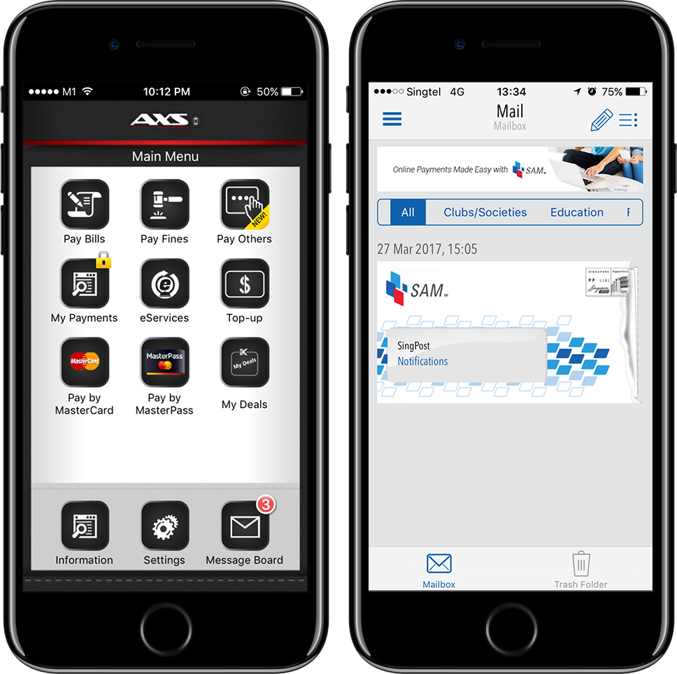
Many Singaporeans use the AXS kiosks located around the island to pay their bills and fines even though there’s an AXS mobile app available – why are they choosing to use the kiosk over the convenience of a mobile app?
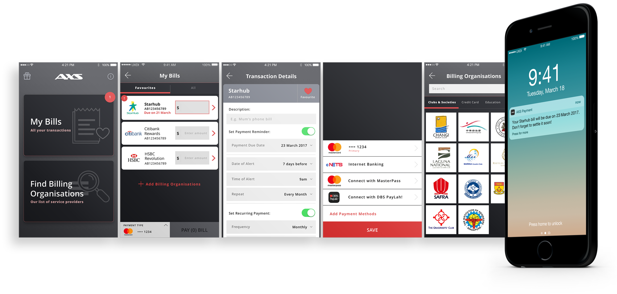
As competition amongst service providers increased, a redesign of the user experience became essential. In a team of three, we sought to build an interface that streamlines the transactions to create a truly personalized experience.
The Challenge
AXS needed a design solution that would strengthen their positioning against their direct competitor – My SAM app. At the same time differentiating itself from other financial sectors' online payment platform.
The Discovery
To better identify AXS’ users, we conducted contextual, guerrilla user interviews and testing of the AXS kiosk, AXS m-Station as well as the competitor's app.
Insights gathered were synthesized into broad themes, reframed into design challenges and served as the basis for ideation and design refinement. We created archetypes from these user segments and identified their pain points and unique considerations.
Personalised transactions
Barcode scanning of bills
Ease of payment

Timely reminders
The Proposed Solution
Simplifying a
financial service
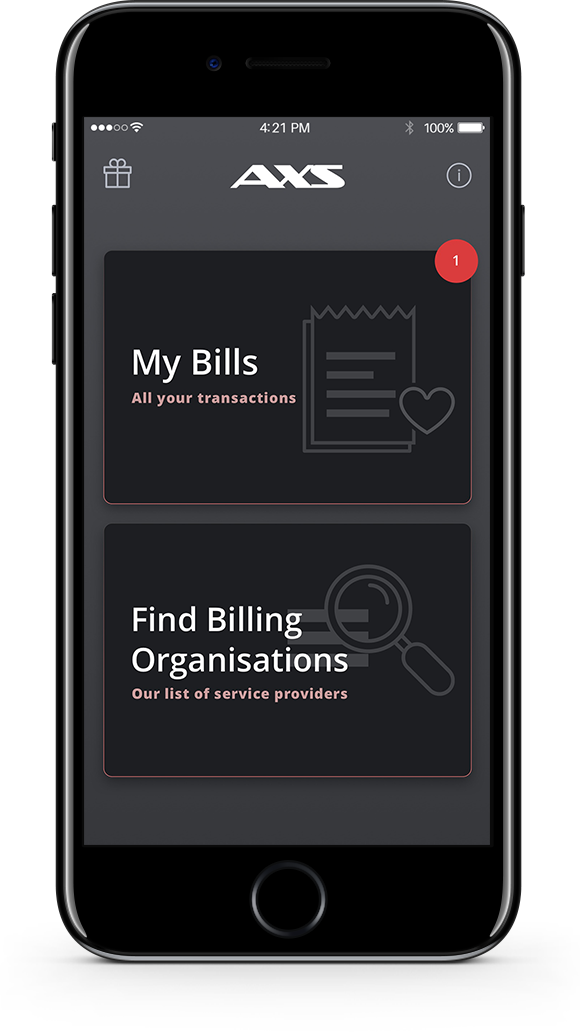
We crafted specific solutions to meet real use cases and tested them to ensure that our solutions would hit the mark. Navigation complexity was simplified by putting the bill payment experience first, allowing the user to quickly understand the interface.
An iterative research and building process executed in two-week sprints, allowed the team to validate ideas through user interaction.
We removed barriers to entry by simplifying steps and refining copywriting, making it easier for users to get started.